Indian publishers still make a basic mistake: they write for desktop and hope the page somehow works on mobile later. That is backward. In India, mobile accounted for 68.14% of web traffic in February 2026, according to StatCounter, which means most readers are seeing your content on a phone first, not a laptop. Google’s own documentation also says it primarily uses the mobile version of a site’s content for indexing and ranking through mobile-first indexing. So this is not just a design issue. It affects discoverability, readability, and traffic.
That is why mobile-first formatting matters even more for publishers chasing search and Discover traffic. Google’s people-first content guidance says content should be made to help users, not just to perform for rankings. If a page opens with clutter, huge intro blocks, poor spacing, and confusing structure, readers leave faster and the content becomes harder for Google systems to interpret cleanly. The problem is not that publishers lack content. The problem is that too much of it is packaged badly.

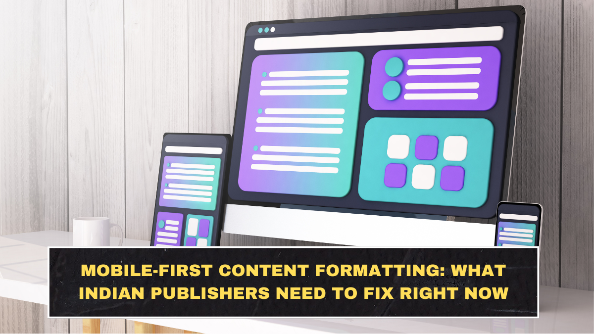
What Mobile-First Formatting Actually Means
Mobile-first formatting does not mean only using a responsive theme. That is the bare minimum. It means the page must be easy to scan, easy to understand, and easy to extract into key points on a small screen. Google’s AI features guidance says site owners do not need special markup to appear in AI features, but they should focus on unique, valuable content and a good page experience. That means structure matters more now because messy pages are harder to parse, summarize, and trust.
For publishers, that translates into a few practical rules. The headline should be clear, not overloaded. The first paragraph should explain the topic quickly. Headings should break the article into useful sections. Paragraphs should be readable on a phone without becoming one-line fragments. Images should support the point instead of interrupting the flow. Most importantly, the page should not make readers work too hard to find the answer. That is where many Indian sites still fail. They bury the useful part under slow, bloated intros and filler wording.
The Biggest Formatting Mistakes Indian Publishers Still Make
The first mistake is writing oversized intros. A phone screen cannot carry the same reading comfort as desktop, so a 200-word opening paragraph feels heavy immediately. Google’s helpful content guidance keeps pushing creators toward satisfying, people-first content, and that starts with getting to the point early. If a user has to scroll too much before understanding what the article is about, the structure is already weak.
The second mistake is poor heading discipline. Many pages use vague subheads such as “Things to Know” or “Important Update,” which tell the reader nothing. On mobile, headings work like signposts. They help readers scan and help search systems understand topical flow. Google’s AI features documentation specifically frames content inclusion around usefulness and accessibility of page information, which becomes easier when the structure is clean and direct.
The third mistake is formatting that looks “busy” instead of useful. Too many bold lines, unnecessary separators, pop-ups, ad blocks between paragraphs, and awkward embedded widgets create friction. Google’s mobile-first indexing guidance says the mobile version should contain the same important content and metadata as desktop, but that does not mean loading the screen with distractions. Content parity matters. Chaos does not.
Table: What Better Mobile Formatting Looks Like
| Page element | Weak version | Better mobile-first version | Why it helps |
|---|---|---|---|
| Intro | Long, vague background | Clear summary in first 2–3 sentences | Reduces bounce and improves clarity |
| Headings | Generic and repetitive | Specific, topic-led headings | Helps readers scan faster |
| Paragraphs | Huge blocks or one-line fragments | Medium-length, clean paragraphs | Better reading rhythm on phones |
| Visuals | Decorative or misplaced | Relevant images near the right section | Supports understanding, not clutter |
| Layout | Too many interruptions | Smooth flow with fewer distractions | Improves mobile usability |
| Content order | Slow lead-in, answer buried late | Most useful point appears early | Better for readers and AI summaries |
How to Format Content So It Works Better for Readers and AI Summaries
The smartest approach is simple. Start with a direct answer or clear context in the opening. Then use H3 sections that each solve one part of the reader’s question. Keep paragraphs long enough to feel complete but short enough to stay comfortable on mobile. This balance matters because extreme chunking can feel messy, while oversized walls of text feel exhausting. Readers do not want either.
After that, make each section pull its weight. A heading should preview the next idea clearly. A table should simplify a comparison. A short list should only appear when it truly improves comprehension. This is also where many publishers misunderstand “AI-friendly” writing. It does not mean robotic language. It means structured clarity. Google’s AI guidance is blunt about focusing on valuable content and strong user experience, not gimmicks.
It also helps to think visually. On Indian mobile screens, clutter shows faster and patience runs out sooner. So use white space well, avoid image overload, and keep key information above the first long scroll when possible. The goal is not just to look clean. The goal is to make the article feel easier than the competing page. That is a real advantage when readers are skimming dozens of tabs, feeds, and summaries every day.
What Indian Publishers Should Fix Right Now
If you run a content site in India, audit your top pages on an actual phone, not just a desktop preview. Check whether the article’s core point is visible quickly, whether the headings are specific, whether the paragraphs feel readable, and whether ads or widgets break the flow too often. Then compare the mobile and desktop versions to ensure important content, metadata, and structured data are consistent, because Google’s indexing systems rely on the mobile version.
The hard truth is this: many publishers do not have a content problem. They have a packaging problem. Their articles may contain useful information, but the formatting makes them slower to consume and harder to trust. In 2026, that is costly because readers are more impatient, Google is more mobile-dependent, and AI-driven search experiences reward clarity more than bloated writing.
Conclusion
Mobile-first content formatting is no longer a nice extra for Indian publishers. It is a direct response to how people actually read and how Google actually indexes pages. With mobile driving 68.14% of web traffic in India and Google relying on the mobile version of content for indexing, publishers that still format like it is 2018 are creating avoidable weaknesses.
The fix is not complicated. Get to the point faster, tighten headings, clean up paragraph structure, reduce clutter, and make the page easier to skim and summarize. That is what better mobile formatting really means. Not prettier pages. More usable pages. And that is what wins now.
FAQs
Does mobile-first formatting affect SEO?
Yes. Google uses the mobile version of content for indexing and ranking, so weak mobile structure can hurt visibility.
Why does mobile formatting matter more in India?
Because mobile made up 68.14% of web traffic in India in February 2026, making phones the main reading environment for most users.
Does AI-friendly content need special markup?
No. Google says you do not need special markup for AI features, but you do need unique value and a good page experience.
What is the biggest formatting mistake publishers make?
Usually, it is burying the useful point under long intros, vague headings, and cluttered page layout. That hurts both readers and discoverability.