Patina blue is rising because people are tired of homes that look clean but feel dead. The older all-white, flat-beige, ultra-sterile look still exists, but it no longer gives many rooms the warmth or personality people want. In 2026, color forecasting and search-led trend reports are pointing toward cooler blues, smoky blue-greens, and layered shades that feel calm, collected, and slightly aged rather than sharp and glossy.
What makes patina blue different is that it does not behave like a loud trend color. It sits somewhere between blue, gray, green, and oxidized metal, which is exactly why it works in real homes. It feels softer than navy, less childish than sky blue, and more interesting than plain gray. Brands and forecasters are openly leaning into calming blue families for 2026, including Pinterest’s “Cool Blue” trend and Dulux’s 2026 blue-focused palette, which described its hero shades as calming and space-changing.

Why is patina blue suddenly working so well in modern homes?
Patina blue fits the emotional mood of the market. People want spaces that reduce stress, feel personal, and look lived in without appearing messy. That shift is showing up across design coverage and color forecasting, where muted blues are being framed as grounding, serene, and easier to live with than hotter statement shades. Even when trend reports do not use the exact phrase “patina blue,” they keep circling the same family of dusty, cool, softened blues.
The other reason is practical: patina blue bridges old and new. It works with vintage wood, brass, linen, limewash, stone, and matte black far better than bright blue ever could. Houzz trend reporting has also highlighted continued interest in wood elements and warm metal accents, which matters because these are the exact companions that stop blue from feeling cold or flat. That pairing is not accidental. It is the difference between a room that feels designed and one that feels like a bad paint experiment.
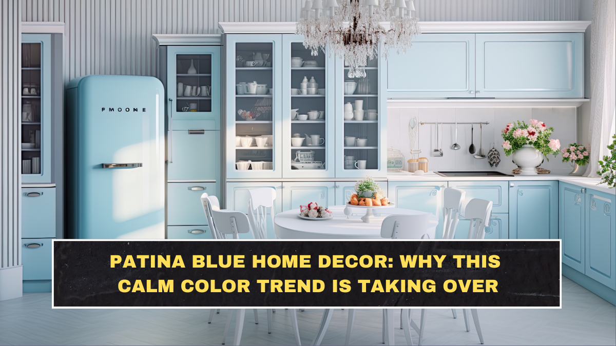
What does patina blue actually look like in a room?
In real spaces, patina blue usually shows up as a weathered, softened shade rather than a pure blue. Think oxidized copper, cloudy coastal paint, smoky blue-green ceramics, or a wall color that looks slightly different from morning to evening. That shifting quality is part of its appeal because it gives a room depth without needing dramatic patterns or too many decorative objects. Paint brands have leaned into this language for years, using names such as “Peaceful Blue,” “Relaxing Blue,” and similar muted tones to signal the same emotional effect.
The smartest version of this trend is not a full room drenched in icy blue with nothing to soften it. That is where people screw it up. A better approach is to use patina blue where texture and age already exist, such as painted cabinets, ceramic lamps, sideboards, upholstery, or wallpaper with faded undertones. This lets the color feel collected rather than forced, which is exactly why it photographs well and still feels comfortable in everyday life.
How can you use patina blue without making a space feel cold or dated?
The biggest mistake is treating blue like a one-step solution. Patina blue needs support. It looks strongest with warm woods, antique brass, cream upholstery, natural linen, tan leather, plaster finishes, and imperfect handmade surfaces. Without that balance, the room can slide into either coastal cliché or old-fashioned dullness. The trend works because it mixes calm color with tactile warmth, not because blue alone magically fixes bad design.
Here is a simple breakdown of where it usually works best:
| Area of the home | Best way to use patina blue | What to pair it with | Main risk |
|---|---|---|---|
| Living room | Accent wall, sofa, rug, ceramics | Oak, walnut, brass, ivory textiles | Too much gray can make it dull |
| Kitchen | Lower cabinets, island, backsplash accents | White walls, wood stools, warm metal | Can feel cold under harsh lighting |
| Bedroom | Bedding, painted furniture, soft wall tone | Linen, cream, soft green, matte finishes | Overdoing cool tones can feel flat |
| Bathroom | Vanity, tile accents, towels | Stone, off-white, brushed brass | Can turn clinical if too glossy |
Which decor styles match patina blue best?
Patina blue works best in styles that already accept softness, imperfection, or layering. That includes modern vintage, quiet luxury, updated farmhouse, relaxed traditional, and soft contemporary interiors. It also works in homes trying to move away from sterile minimalism without becoming cluttered. That matters because many people are not really looking for “blue decor.” They are looking for a calmer home that still has personality, and this shade helps deliver that without shouting for attention.
It is weaker in spaces built around high-gloss finishes, very cold lighting, or aggressive black-and-white contrast. In those rooms, patina blue can look accidental or washed out. If the home already has warm flooring, natural materials, or vintage pieces, the color becomes much easier to use. This is why the trend keeps showing up in editorial interiors that feel layered and expensive rather than flashy and temporary.
Is patina blue just another short-term Pinterest trend?
Not exactly. Pinterest Predicts is based on search behavior and forecasting, not random guessing, and its 2026 reporting clearly points to cool blue as one of the defining color directions. That does not guarantee every version of the trend will last, but it does suggest demand is broad enough to matter. More importantly, muted blue families have a longer shelf life than novelty colors because they sit close to neutral behavior while still adding mood.
So the blunt truth is this: patina blue has staying power only when it is used as a supporting mood color, not as a gimmick. Use it in layered, textured, slightly imperfect ways and it feels timeless. Use it like a social-media stunt and it will age badly.
What is the smartest way to try patina blue before committing?
Start small and test it in objects first. A lamp base, throw pillows, a bench, painted side table, or ceramic vase will tell you quickly whether your room can carry the tone. If the shade looks dead beside your flooring or clashes with your lighting, you just saved yourself money and regret. If it looks richer through the day and softens the room, then move to a bigger commitment like cabinetry, wallpaper, or a muted wall color.
Conclusion
Patina blue is taking over because it answers a real design need: people want calmer homes, but they do not want boring homes. This shade works when it brings together softness, age, texture, and warmth. It fails when people copy the color without copying the balance. That is the part most trend coverage leaves out. The color is not the magic. The combination is.
FAQs
Is patina blue better than navy for small rooms?
Usually yes, because patina blue feels softer and less heavy. Navy can look rich, but in smaller rooms it often darkens corners too aggressively unless the lighting is excellent.
Does patina blue work in Indian homes?
Yes, especially in homes with warm wood furniture, brass accents, beige flooring, cane textures, or off-white walls. It tends to work better than icy blue because it has more depth and warmth.
What colors go best with patina blue?
Cream, soft white, sand, taupe, olive, walnut, oak, terracotta, and aged brass usually pair well with it. Pure cool gray is the pairing most likely to make it look lifeless.
Should patina blue be used on walls or furniture first?
Furniture or decor accents are safer for most people. Walls are a bigger commitment and can shift heavily depending on daylight, bulb temperature, and room size.
Click here to know more